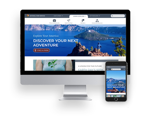
National Park Service
Redesign of a Government Agency website, with a focus on User Interface design, navigation, and information architecture.
Role: UX/UI Designer
Team: Anna Keyser Bolanos & Adriana Garzon P
Tools: Figma, Miro, Trello
The Problem
The current national park service site lacks consistency, unclear use of hierarchy, and can be overall confusing to navigate. Within the NPS site each park has its own page. This created a unique challenge of creating two sets of navigation, two footers, and each with it’s own content. We had to bear in mind through the redesign that access to the global site was still required while navigating the park site.
The Solution
To create a website navigation system that implements a more minimalist design resulting in consistency and efficiency, encouraging more engagement and participation from visitors.
Research
In this research project: we planned and conducted five user tests and interviews created a user personas, and ran heuristic evaluations.
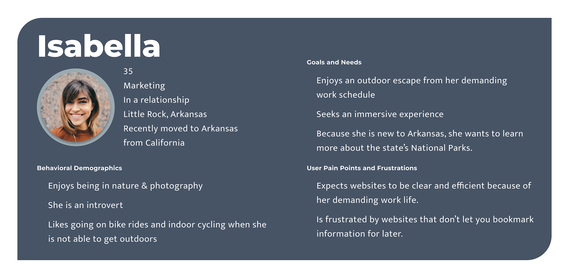
User Persona
We created the persona of Isabella to represent the typical nature enthusiast we imagined frequented the National Park Service website. Based on her persona, we were able to hone in on areas of focus for the redesign.
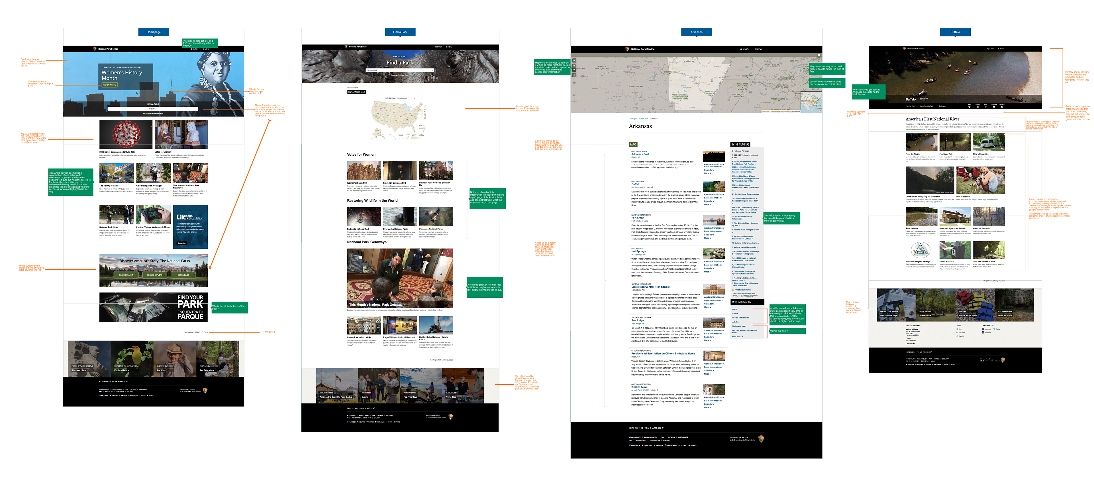
Heuristic Evaluation
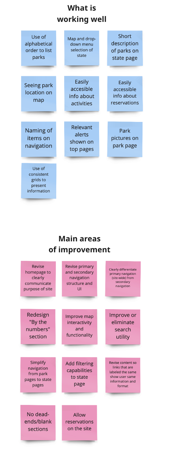
Conducting a heuristic evaluation on the Global site and the Park site quickly provided us with the information we needed about what did and didn’t work. Immediately we recognized a complete lack of consistent navigation and hierarchy. The site overall was difficult to navigate and hard to find your location within the site itself. The site also relied on being very text-heavy and features like “find a park” had many different paths yielding different results.
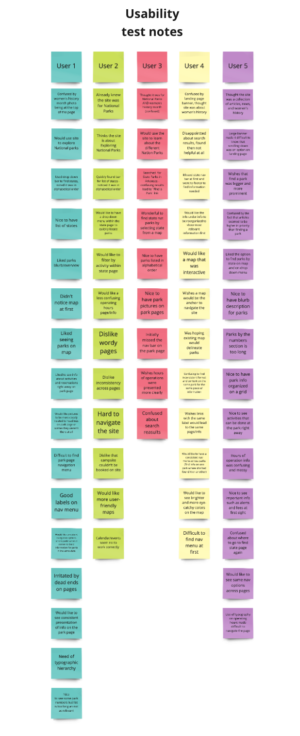
Usability Testing
Goal: Learn how the user interacts with nps.gov while trying to find information about specific parks state parks.
Objectives:
1. Identify the users pain points while searching for a specific park.
2. If the user can recall their steps to find a different park in the same state.
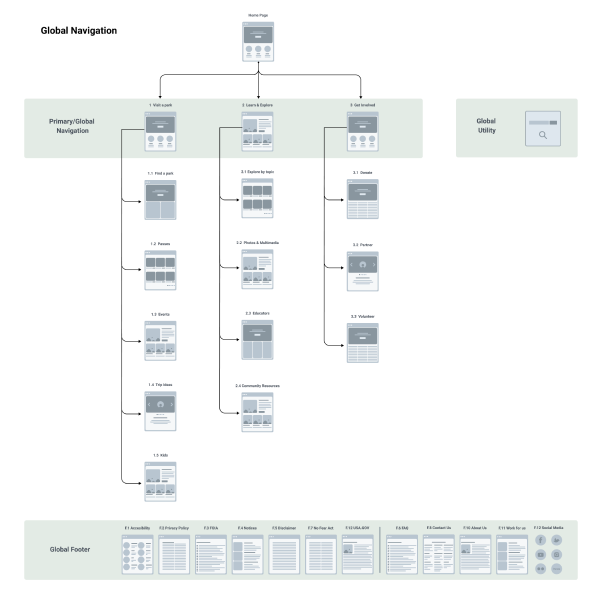
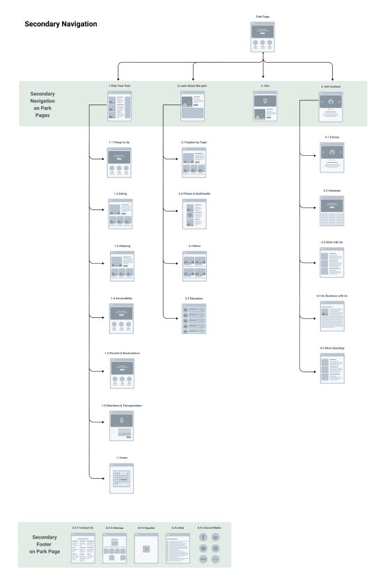
Information Architecture
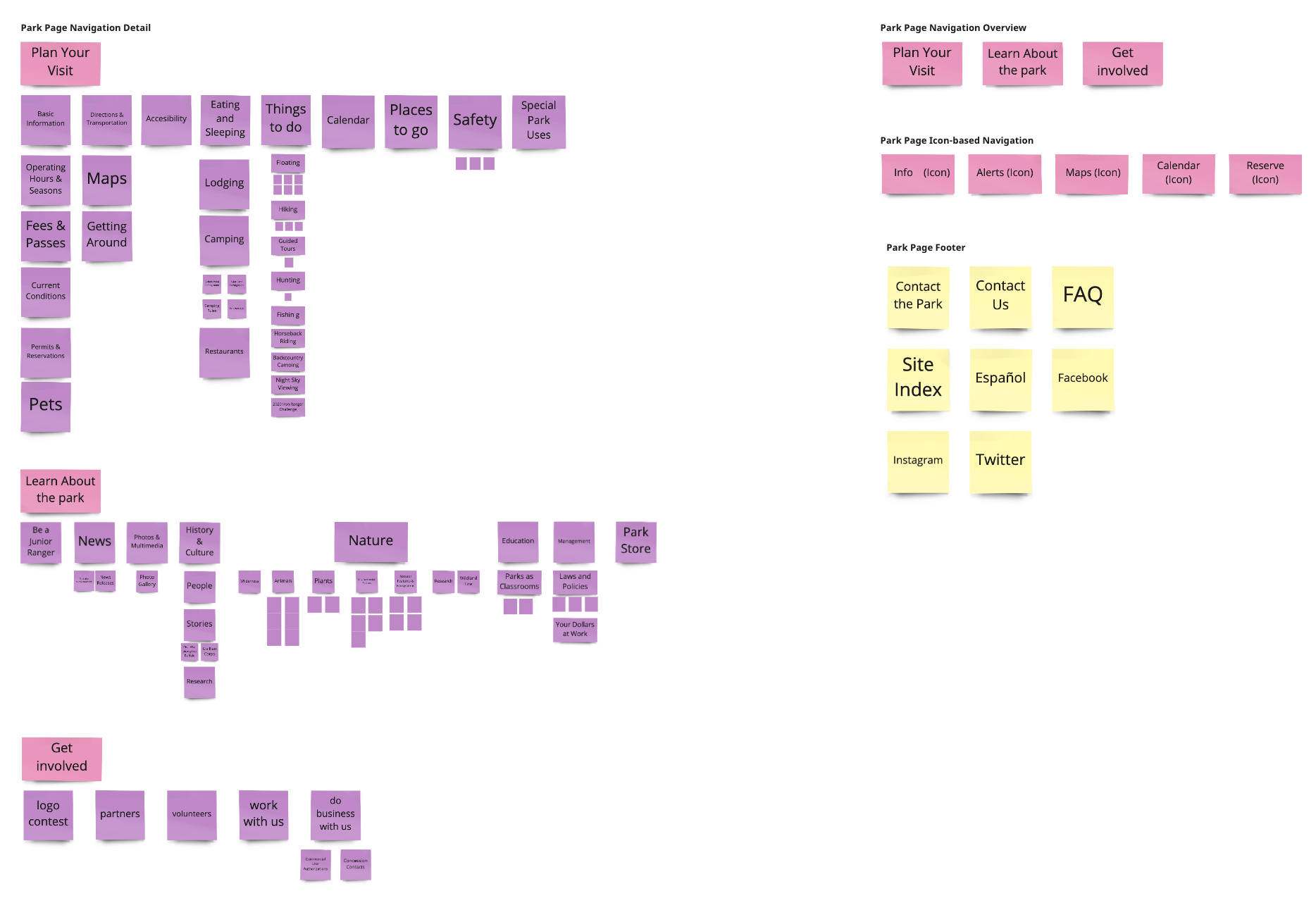
Card Sorting and Sitemap Redesign
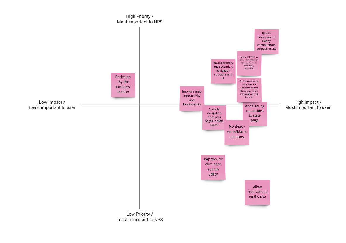
We found card sorting to be an integral part of restructuring the information architecture. We saw that the site had over-complicated both the global and park navigation bars. We were able to make the navigation bar more concise and clear. The feature most used by the users was Find a Park and then within that Park page, finding General Information.
Definition
Concluding our research, we synthesized our findings through card sorting, affinity mapping, and feature prioritization. This led us to prioritize certain objectives and hone in on the most significant UI implementations while keeping in mind the focus of this project's scope being responsive web design. Our focus was on information architecture and building clear UI users quickly understood and wanted to engage with.
Ideation
We quickly constructed the website layout using design principles and being aware of constraints my teammate and I understood from the research and definition stages.
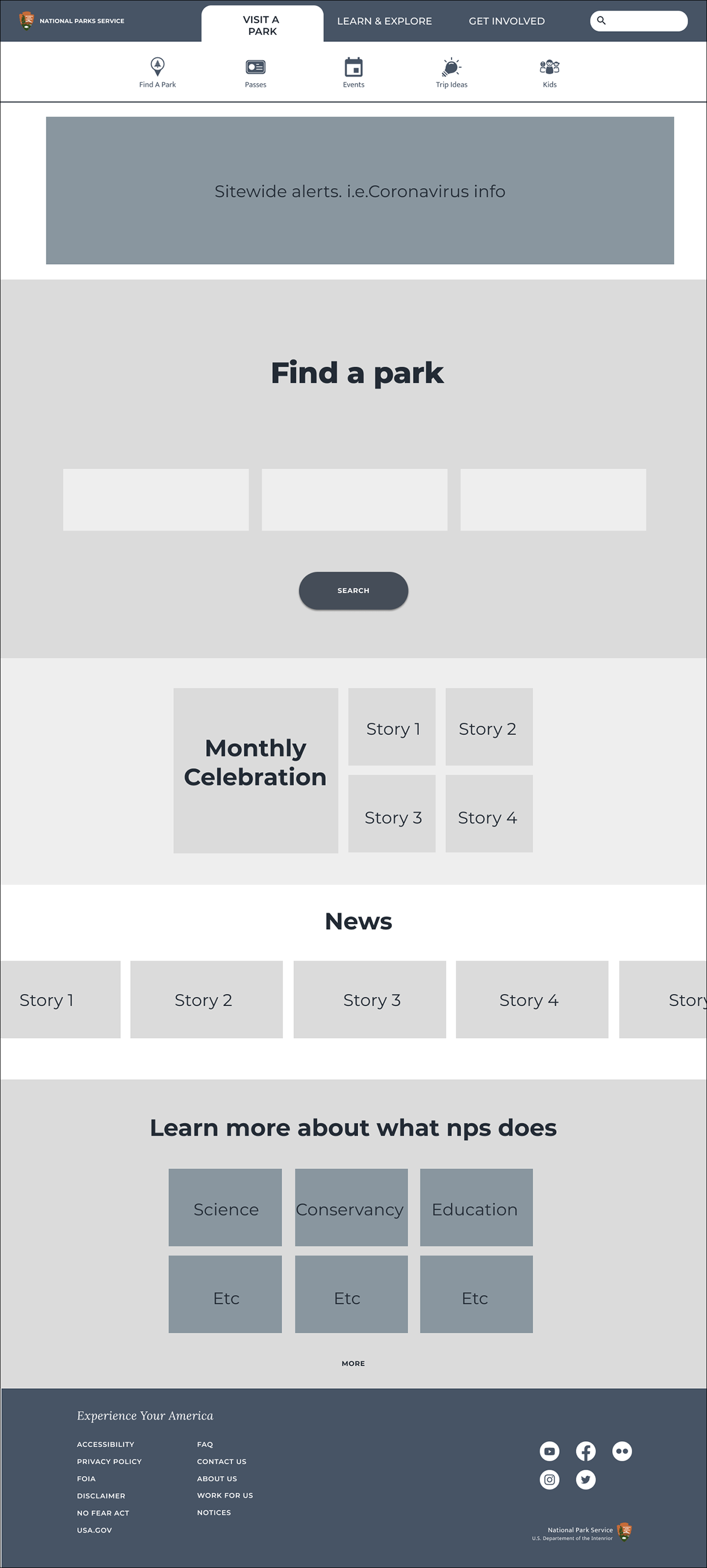
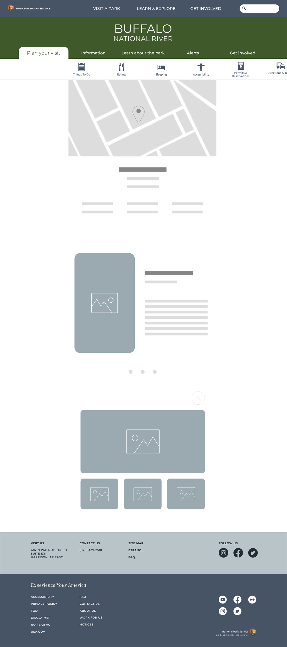
Low-to-mid Fidelity Wireframes
With the Low and Mid Fidelity wireframes we sought to make the interface much more accessible and less cluttered.
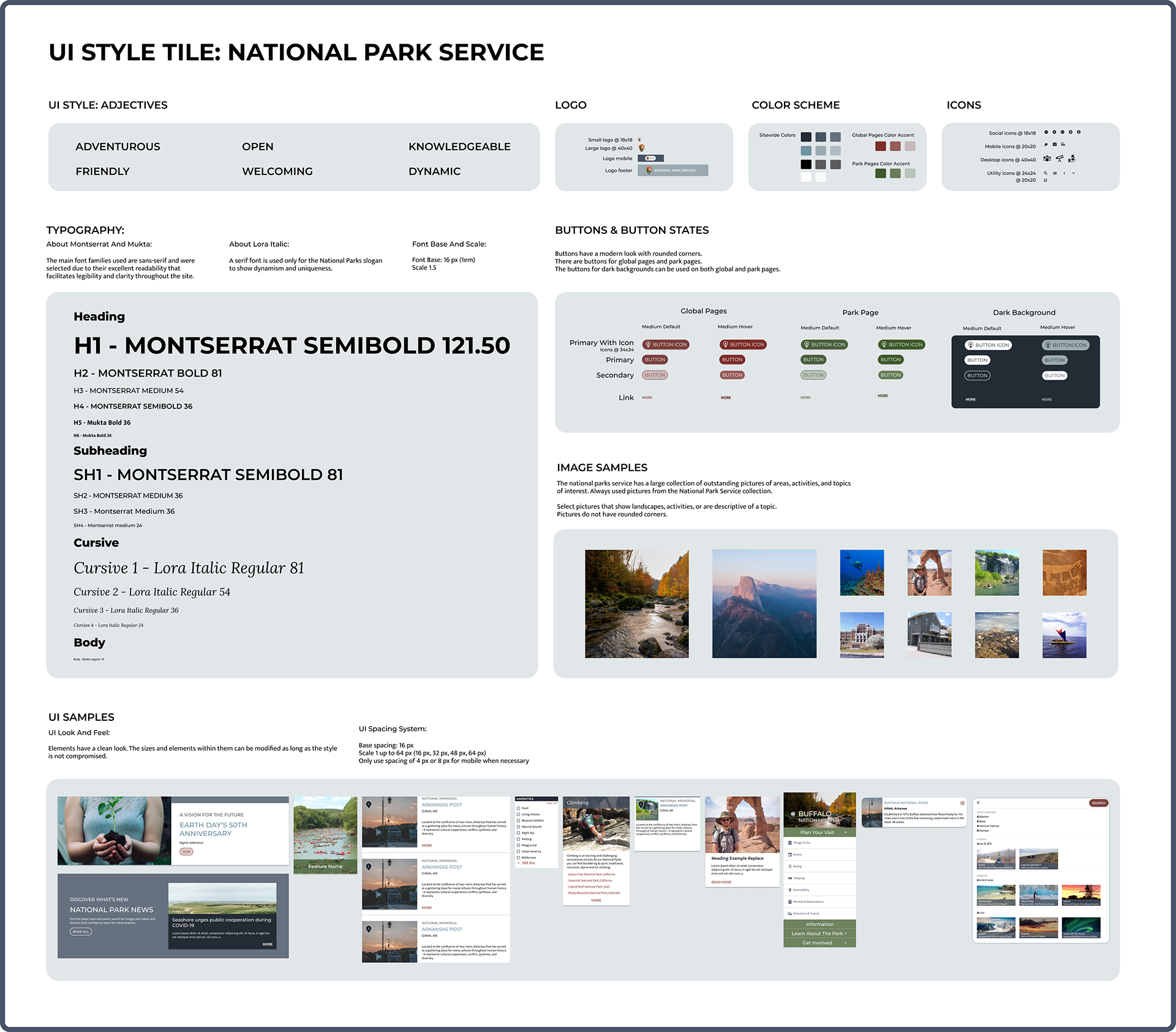
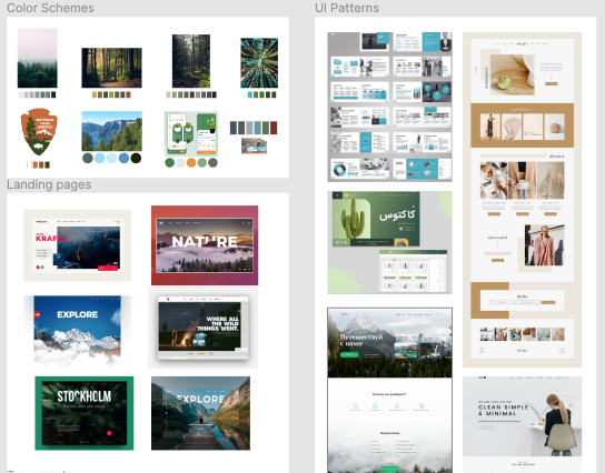
Mood Board and Style Tile
We found it imperative to the process to have a clear accessible components library in figma and condensed this in to our style tile. During the ideation phase of our design process we gathered inspiration for our visual design and UI redesign.
Testing
When we conducted our initial usability test, we wanted to observe and learn how the user interacted with nps.gov while trying to find information about specific parks. With our redesign we wanted to observe users attempting that same path. We learned that the users were pleasantly surprised by the new design and found themselves wanting to engage with the site more than they had before. Each page had a more clear purpose and intention and was much easier for them to navigate. We also learned that some of the ways we choose to label buttons and links were not clear to the user. We also needed to spend more time making sure that the search feature was intuitive and accessible.

High Fidelity Wireframes
Keeping in mind user testing findings, we built out our final high fidelity version. Given this project's scope we would need to do another scrum cycle. Ideally we would conduct another round of user testing to further refine the website's remaining UX/UI issues.

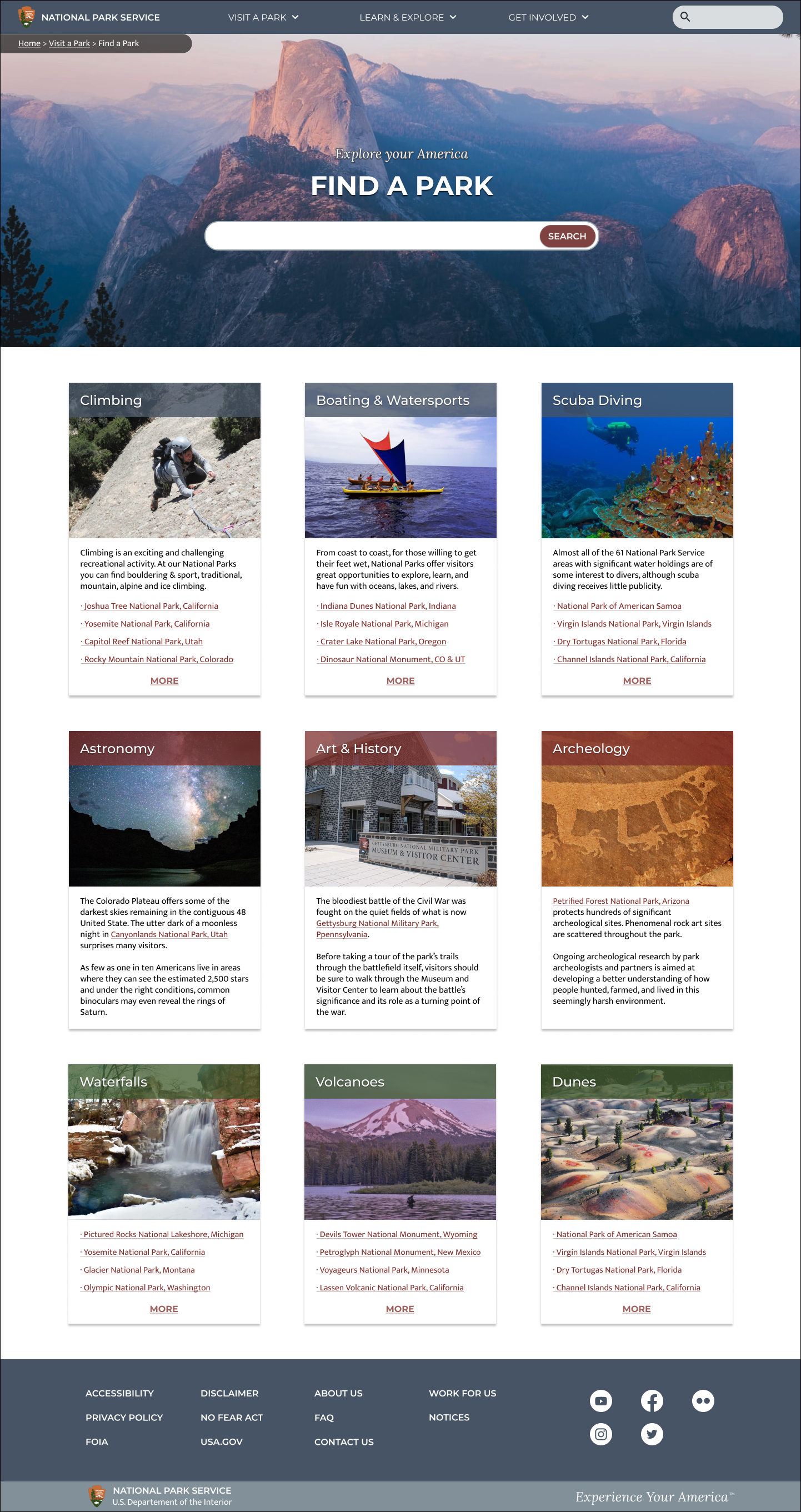
High Fidelity Prototype
Interactive Prototypes:
Final Thoughts
The mission of The National Park Service is one that “preserves unimpaired the natural and cultural resources and values of the National Park System for the enjoyment, education, and inspiration of this and future generations.”
With that in mind, we made it our goal to create a more engaging site so that the visitor is more motivated to participate. If we redesigned a site that is easy to navigate, straightforward, and efficient, we would create awareness around the true mission of the NPS.
One of the biggest challenges we faced was designing two sets of navigation, one for the global site and a second for each specific park. This presented unique challenges in regards to responsive web design. A challenge that helped us understand the importance of information architecture and designing for a variety of platforms.